When Jacksonville Area Legal Aid approached us for a legal aid brand redesign, we knew we had an opportunity to make a real difference. This project wasn’t just about creating a new logo or choosing colors; it was about crafting a visual identity that truly reflected the vital work JALA does in the community. From their annual reports to a comprehensive rebrand, we partnered with JALA to transform their image and expand their impact. Here’s how we bridged the gap between their mission and their visual representation.
A legacy of legal support for the vulnerable
Since 1937, Jacksonville Area Legal Aid (JALA) has been a beacon of hope for Florida’s First Coast. This nonprofit law firm provides essential legal services to those who need it most: low-income and at-risk individuals facing eviction, domestic violence, disability discrimination, and other critical legal challenges. While JALA’s impact on the community has grown and evolved over the decades, their visual identity hadn’t kept pace. It was time for a nonprofit rebrand that truly reflected their mission and the quality of their work.
The challenge
Aligning visual identity with impactful legal services
When we first connected with JALA in 2021, their branding consisted of an outdated logo and little else. As we designed their 2020 and 2021 annual reports, it became evident that this lack of cohesive identity was a significant hurdle. Each year, we found ourselves creating vibrant, standalone designs without the foundation of a robust brand system to build upon. It was clear: JALA needed a comprehensive legal aid brand redesign to:
- Elevate their professional image
- Clearly communicate their civil legal aid services
- Resonate with their diverse audiences: potential clients, pro bono attorneys, and donors
The process
Collaborative strategies for a nonprofit law firm rebrand
To kick off the legal aid brand redesign, we gathered key stakeholders for a strategy workshop. JALA’s executive team, their marketing partner Nancy Kinnally of Relatable Communications Group, and I put our heads together to:
- Identify the shortcomings of the current branding
- Explore how JALA’s goals and mission had evolved
- Discuss the importance of showcasing JALA’s community impact
- Explore visual directions that felt authentic to the organization
Through thoughtful discussion, we distilled JALA’s essence into three core values: Justice, Compassion, and Partnership. We also developed a list of brand adjectives to guide our design process: Reliable, Respectful, Knowledgeable, Empathetic, Optimistic, Experienced, Collaborative, Ethical, and Professional.
The solution
Crafting a cohesive legal aid brand identity
With these insights in hand, we crafted a brand identity that truly captures JALA’s spirit:
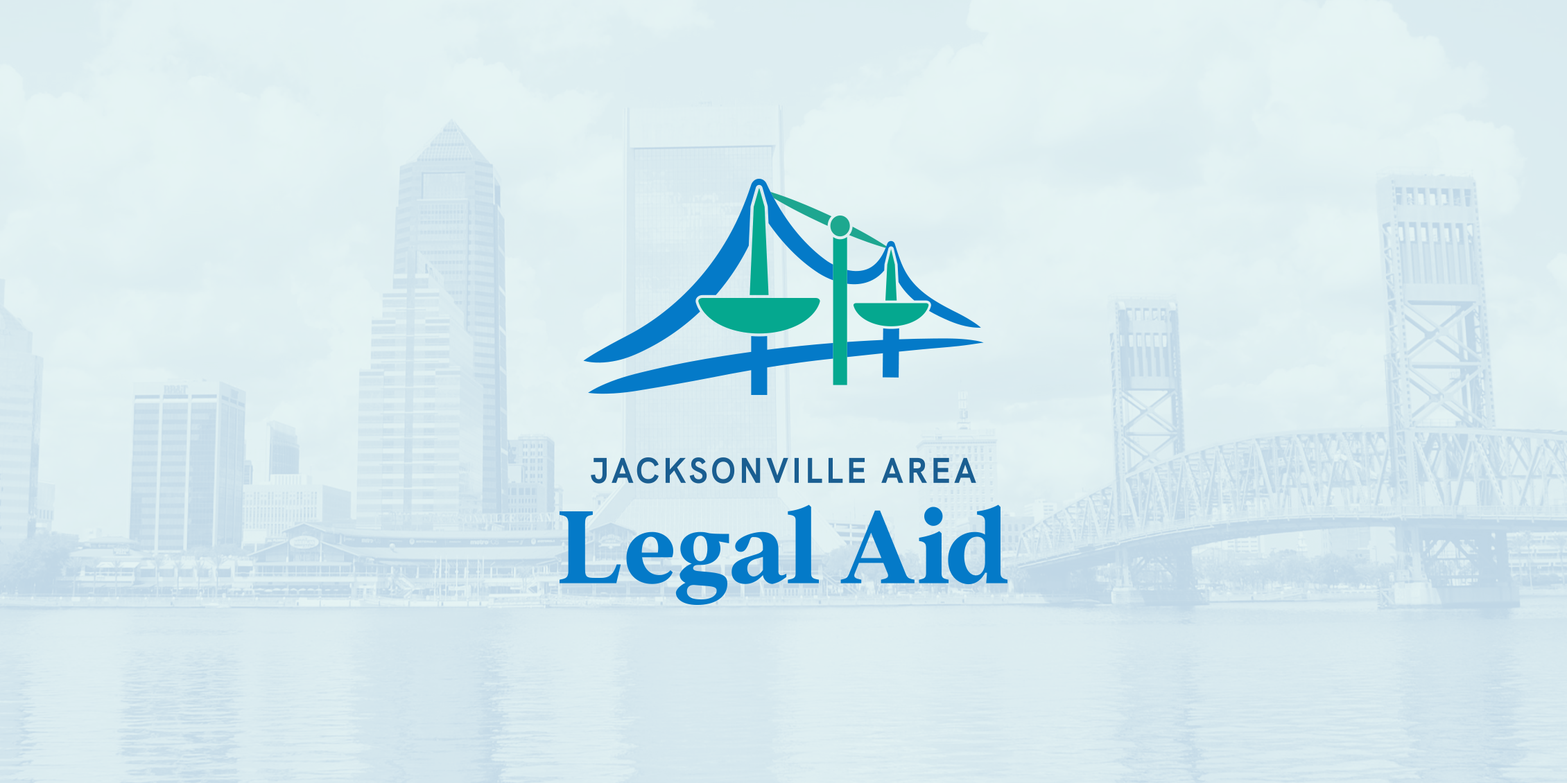
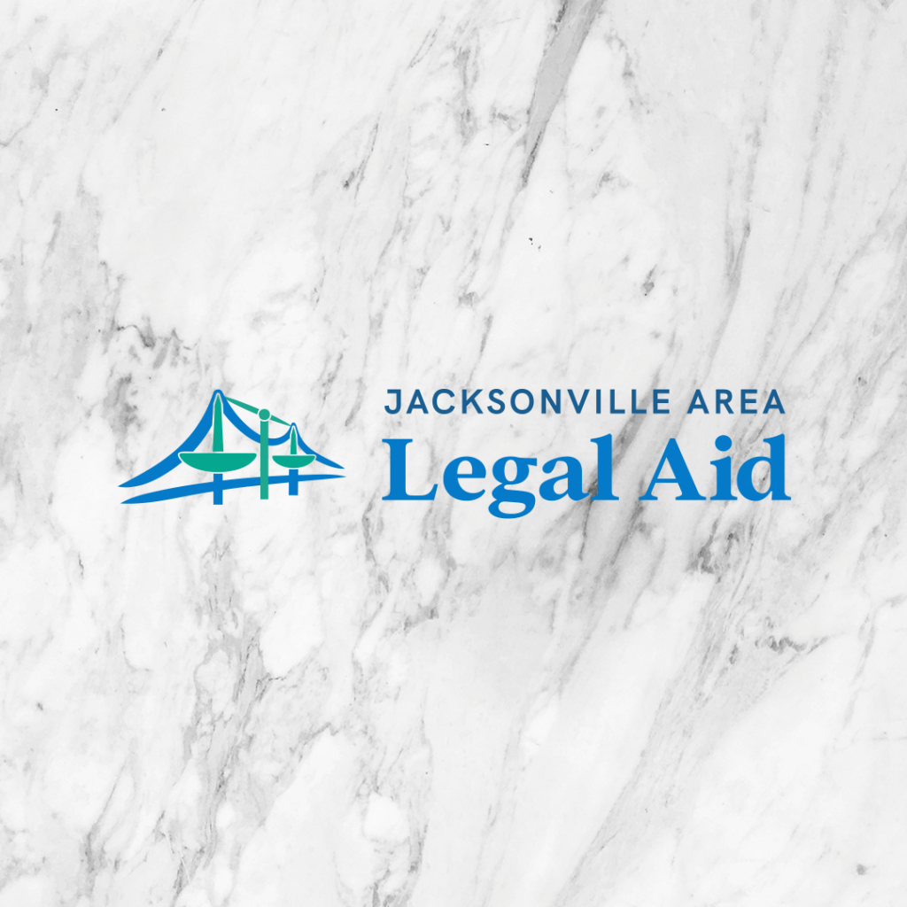
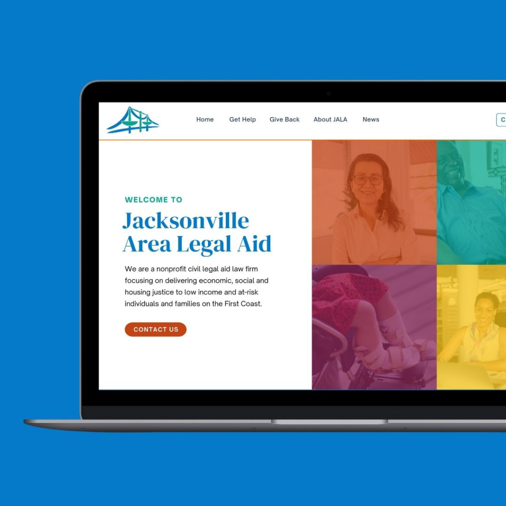
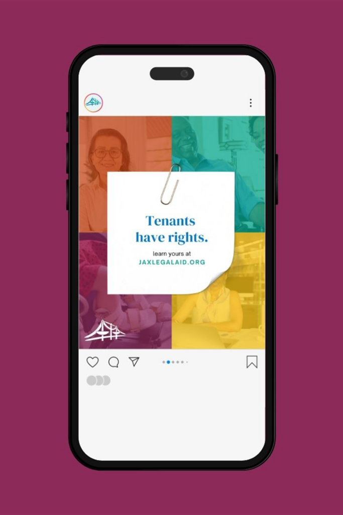
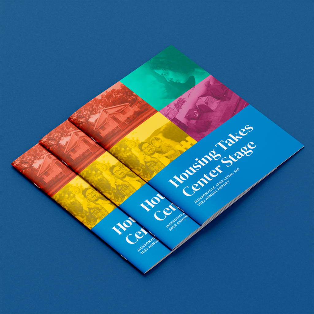
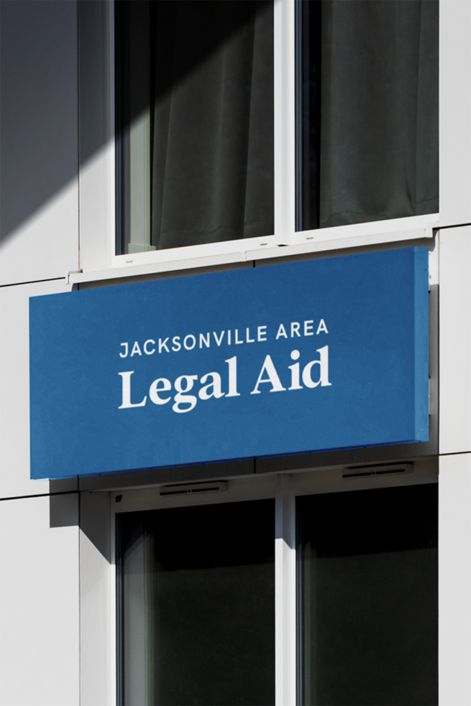
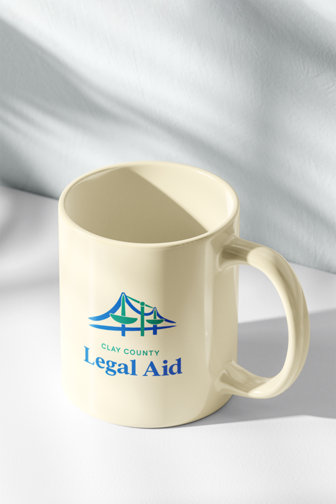
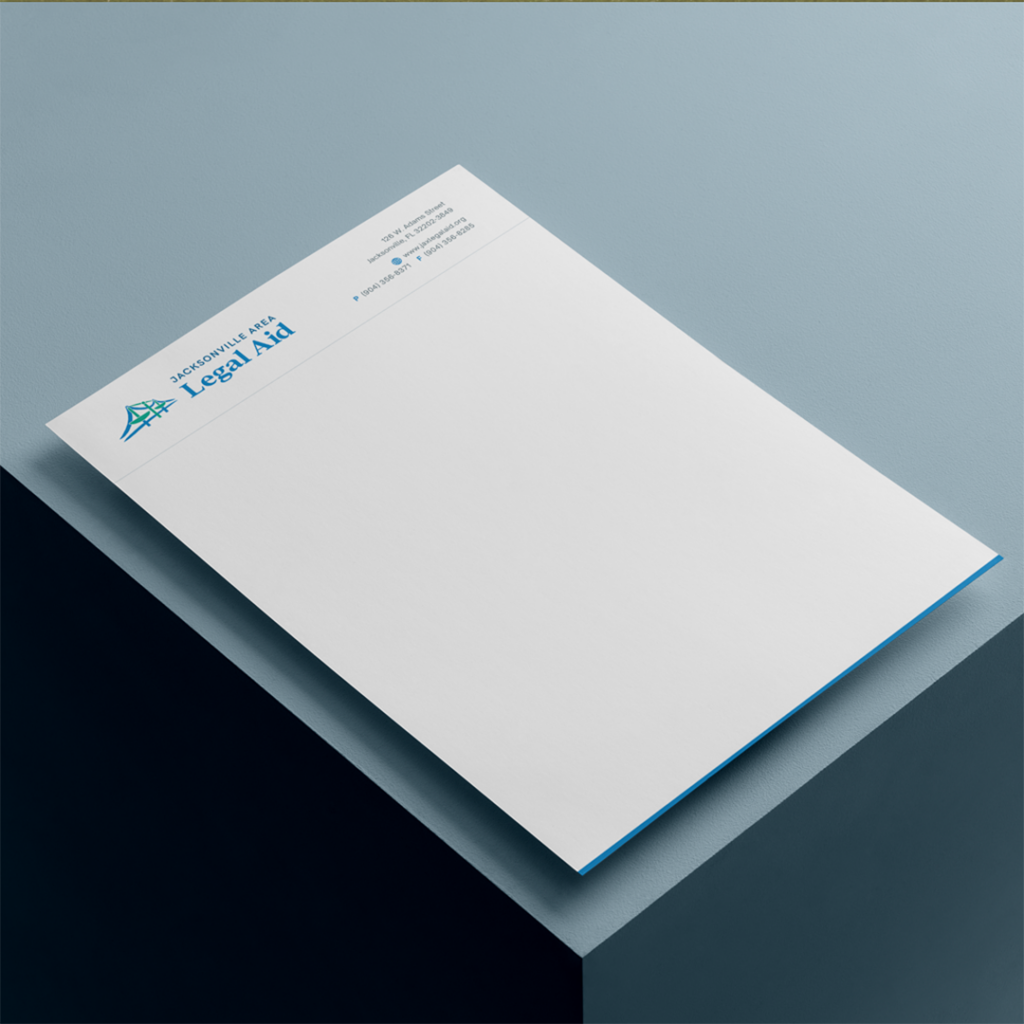
- Logo Set: We reimagined Jacksonville’s iconic bridges, incorporating scales of justice into the supports. This visual metaphor represents JALA’s role as a cornerstone of justice in the community.
- Typography: We paired a professional serif with an approachable sans-serif, striking a balance between authority and accessibility.
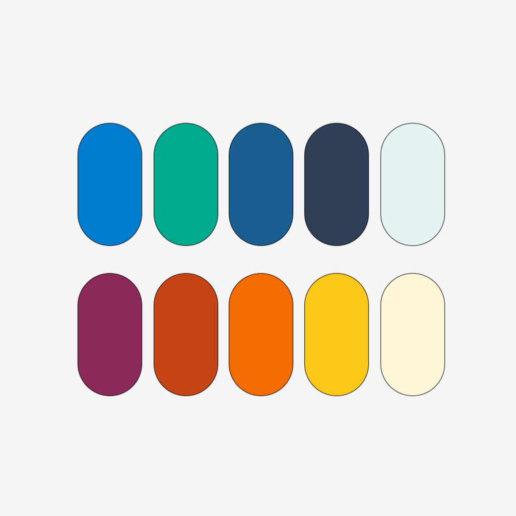
- Color Palette: We developed a vibrant, versatile color system anchored by a core blue and green palette for the main logo.
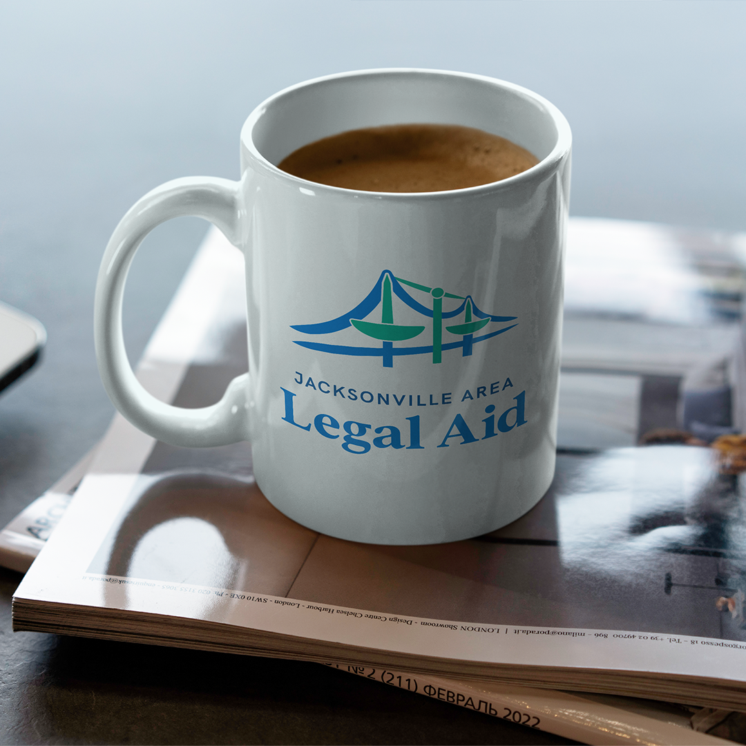
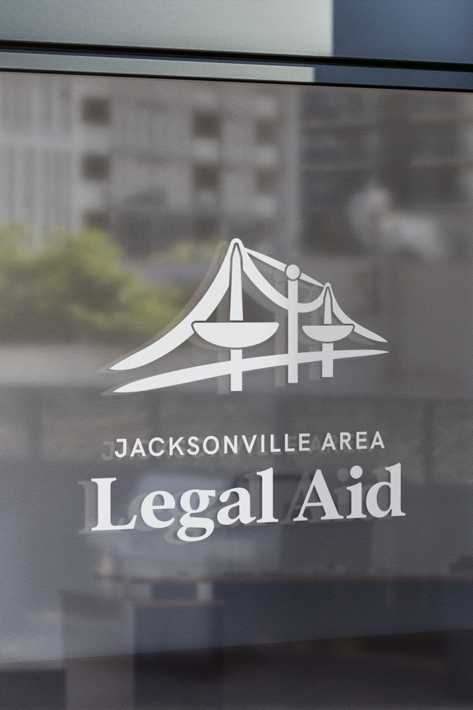
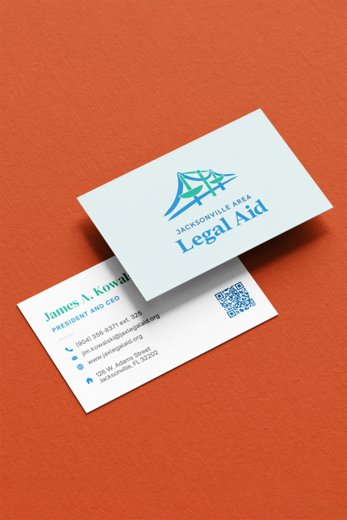
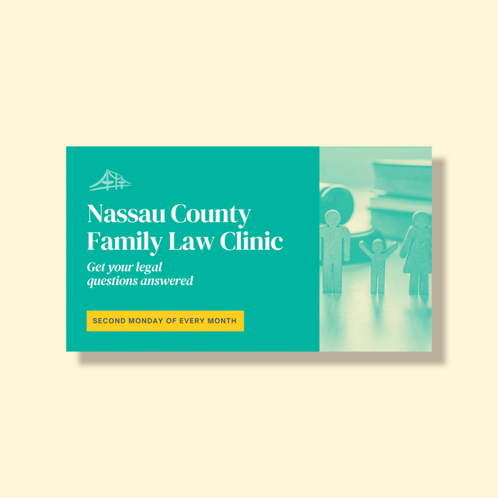
- Brand Assets: To ensure consistency across all touchpoints, we created a suite of social media templates and comprehensive brand guidelines.
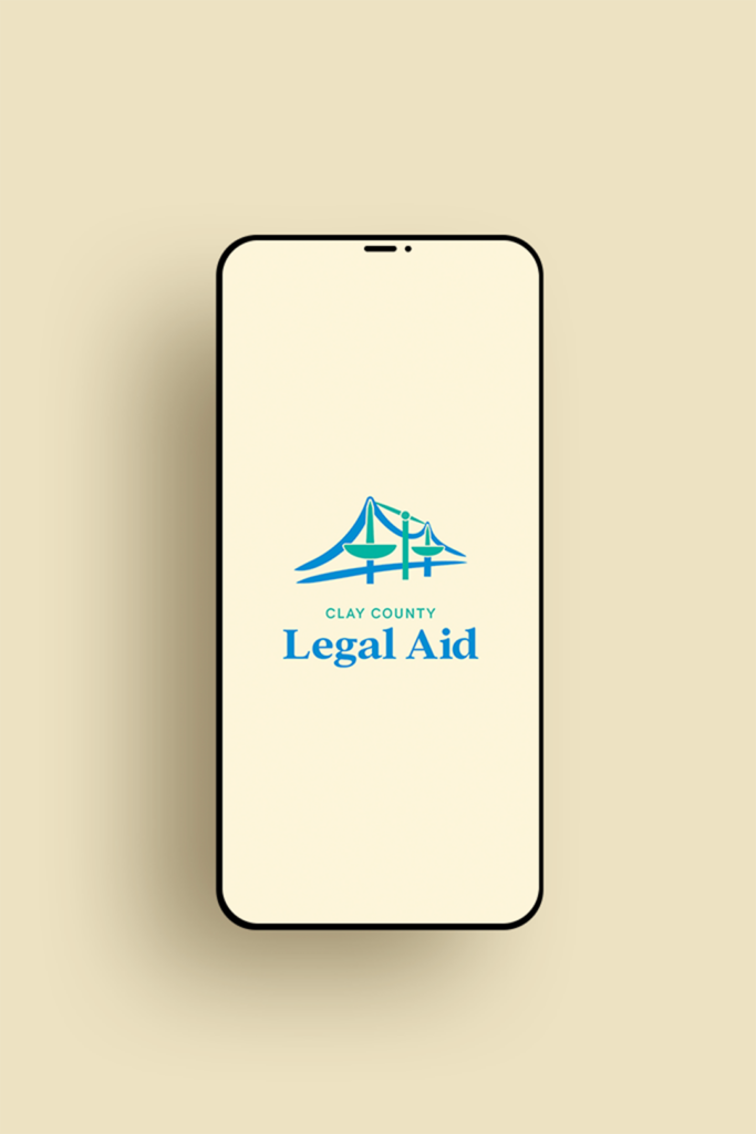
An important aspect of this legal aid brand redesign was addressing JALA’s multi-office structure. While the main office is in Jacksonville, JALA also operates Clay County Legal Aid and St. Johns County Legal Aid. To maintain a cohesive visual identity across all locations while still allowing each office to have its own designation, we created logo variations for the Clay County and St. Johns offices. These variations use slightly different color palettes and replace “Jacksonville Area” with the appropriate county name. The result is a family of logos that clearly communicate each office’s individual identity while reinforcing their connection to the larger JALA organization.
The result
A professional image that speaks to all audiences
JALA’s new brand identity is more than just a fresh coat of paint. It’s a powerful tool that:
- Elevates their professional image to match the caliber of their legal work
- Clearly communicates their role as a civil legal aid firm
- Resonates with clients, attorneys, and donors alike
- Provides flexibility for various applications while maintaining a cohesive look
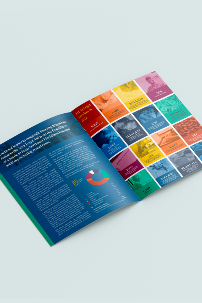
We had the privilege of debuting this new identity in JALA’s 2022 annual report, showcasing how the refreshed brand elements could work together to create impactful communications.
Empowering legal aid through thoughtful design
This rebrand was about more than just creating a pretty logo. This legal aid brand redesign was a transformative process, giving JALA the visual tools to effectively communicate their mission and values. It was about giving Jacksonville Area Legal Aid a visual identity that truly reflects their commitment to justice, compassion, and partnership. Now, when someone encounters JALA’s brand—whether it’s on a business card, a social media post, or their annual report—they’ll immediately get a sense of the organization’s professionalism, expertise, and vital role in the Jacksonville community.
By bridging the gap between JALA’s impactful work and their visual representation, we’ve helped set the stage for their continued growth and success in serving those who need it most.
