When innovative math educator Julie Russo came to Parson Lane with her effective teaching methodology, she had created a framework to help students understand math word problems but needed a visual identity that would do justice to her work. This project illustrates how thoughtful brand design can elevate a mission-driven educational venture.
From limited website to comprehensive educational brand
Julie developed Structures of Equality (SoE) as a reading comprehension tool that enables elementary students to visualize mathematical relationships within word problems. Her approach uses three distinct structures to help students make sense of any K-5 math problem. However, her existing brand and website weren’t communicating the clarity and accessibility that defined her methodology.
What began as a request for simple website improvements evolved into something much more significant. I quickly recognized Julie wasn’t just limited by her website – her entire brand lacked the foundation and flexibility needed to support her expanding educational mission.
Building a cohesive educational brand design
My journey with Julie began through Stacy Eleczko, one of Parson Lane’s copywriting partners, who had been optimizing website copy for Structures of Equality. Together, we discovered the limitations weren’t merely in the content, but in the entire brand system.
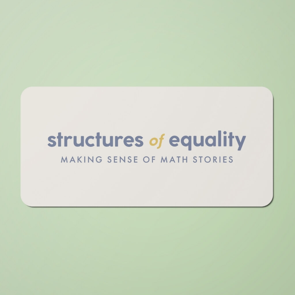
Stacy first developed Julie’s brand messaging, including her tagline “Making sense of math stories,” along with a comprehensive voice and style guide. The messaging emphasized Julie’s deeply held values: fidelity to the teaching process, quality over quantity, equity and accessibility, deep comprehension, and community-centered education.
This strategic foundation gave me clear direction for creating a visual identity that would resonate with both educators and students.
A logo that embodies the teaching methodology
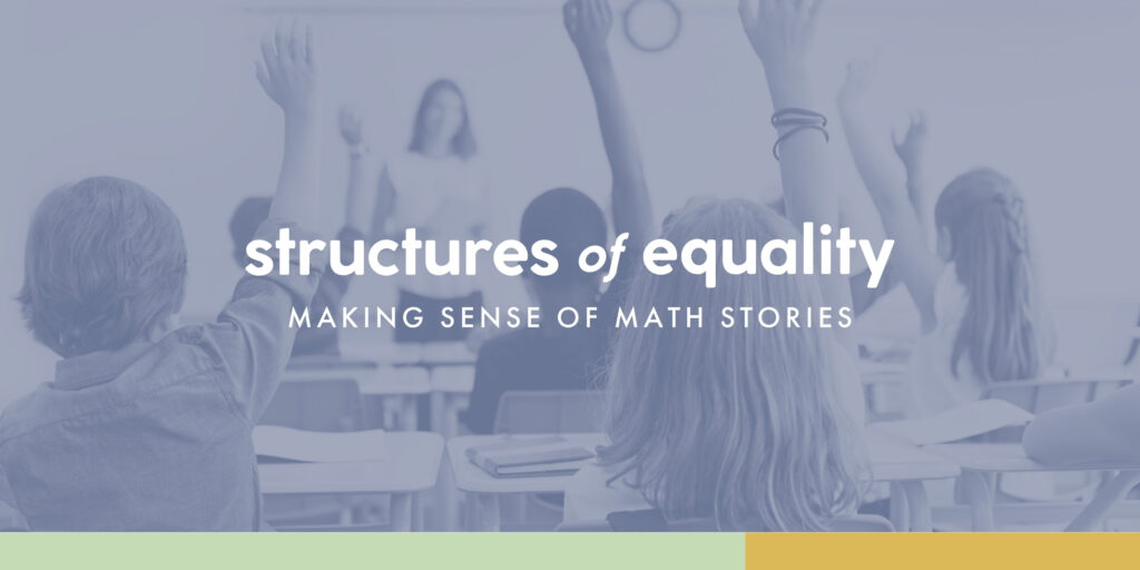
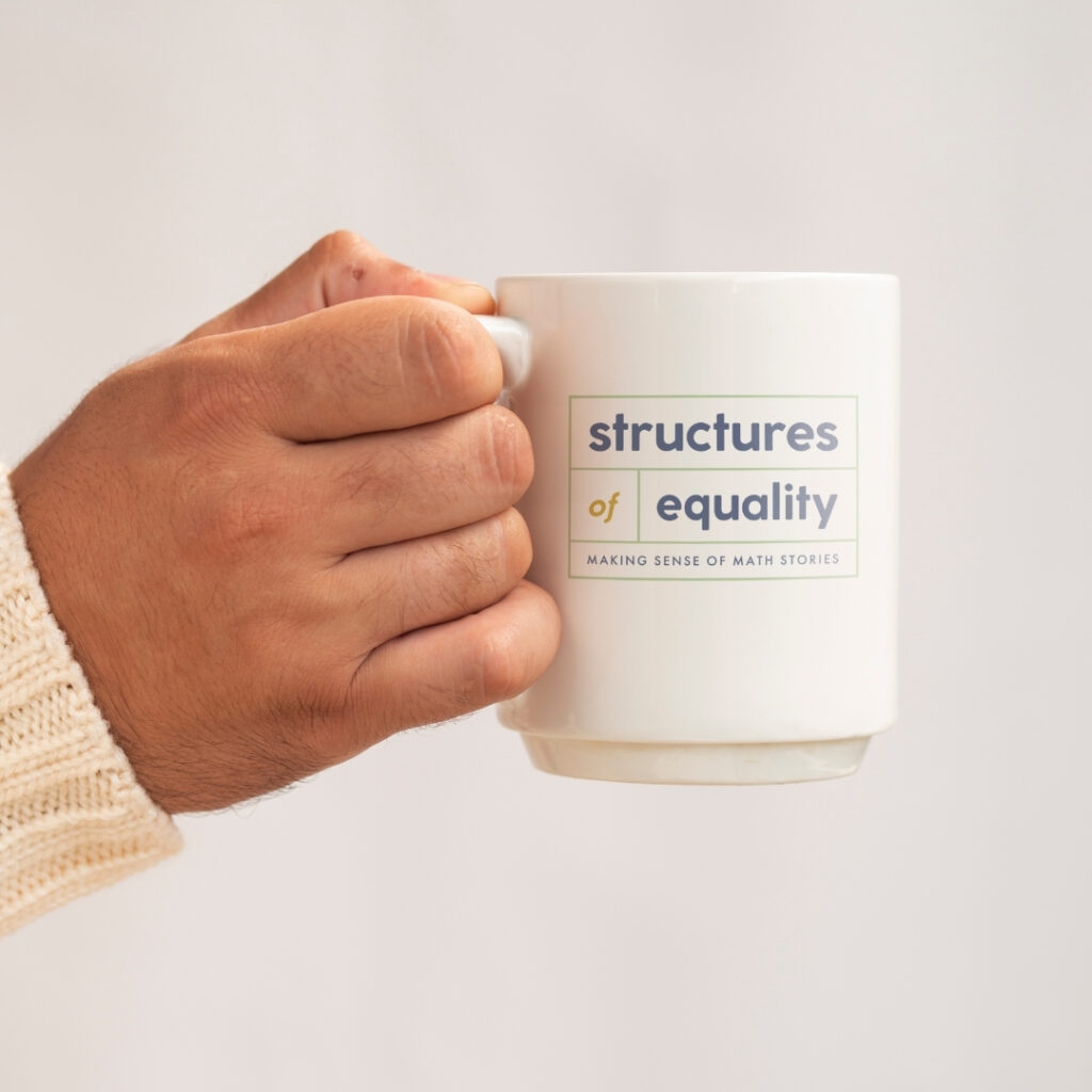
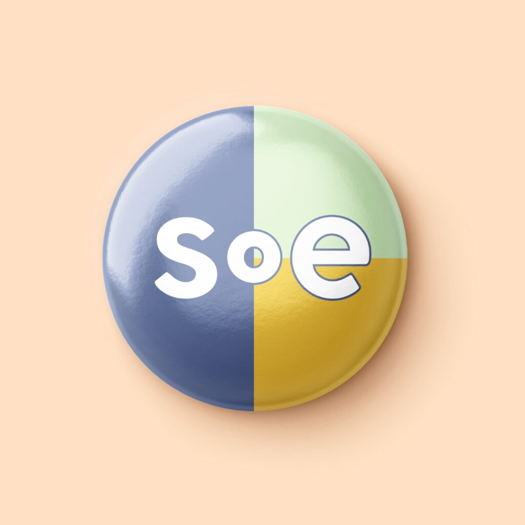
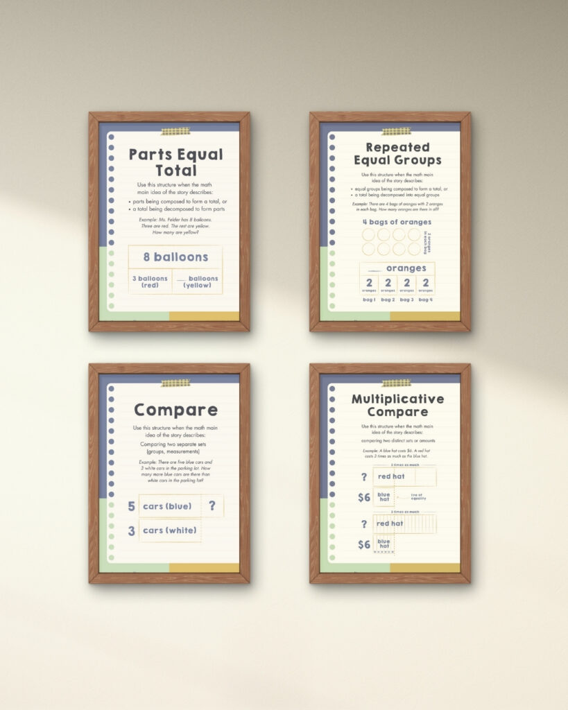
The centerpiece of my design became a versatile logo system that visually references the Parts Equal Total structure – one of the core frameworks Julie teaches. The boxed design elements in the logo directly mirror the visual structure students use to solve math problems.
I developed a complete logo set with variations for different contexts and platforms (primary and secondary logos, wordmarks, brandmarks, and monograms), ensuring the brand would maintain consistency while adapting to any application.
Accessibility through thoughtful color selection
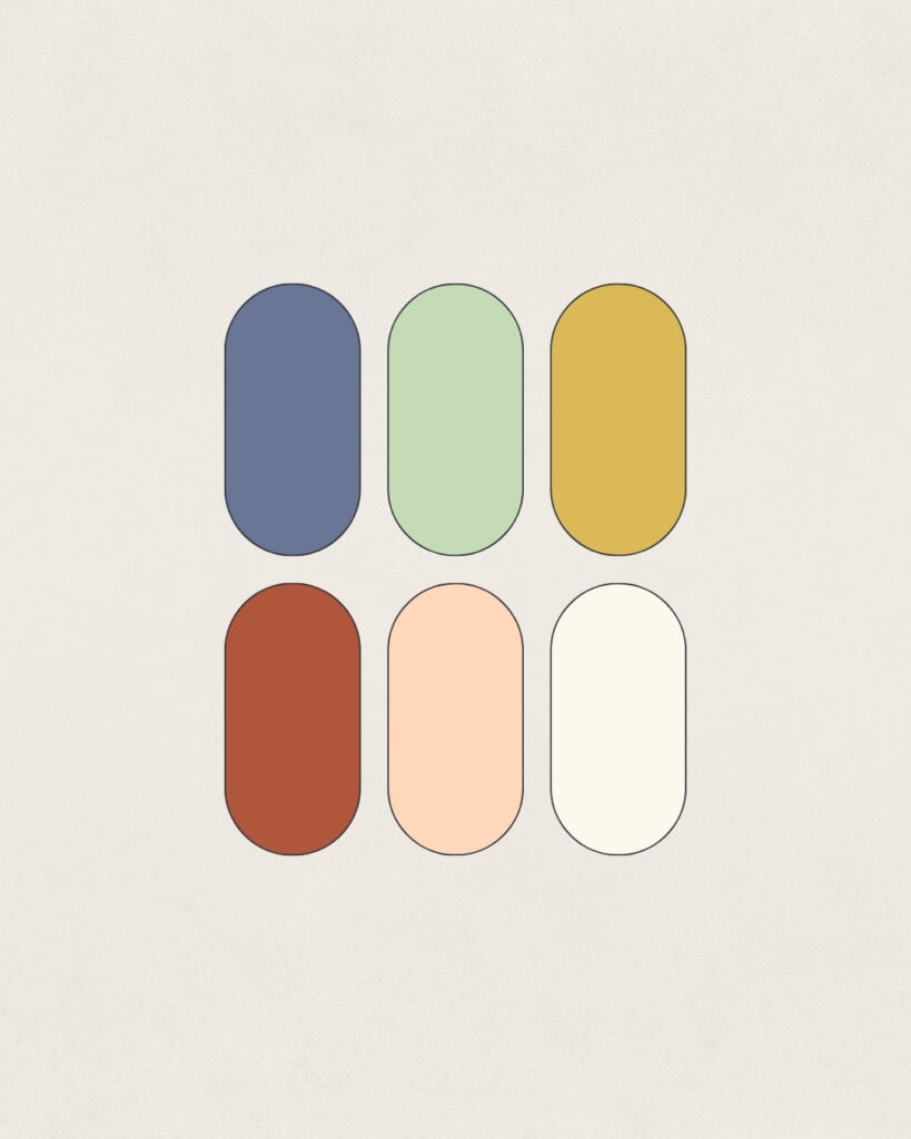
Educational materials demand clear visual hierarchy and excellent readability. Julie’s previous color palette lacked sufficient contrast, making it difficult to create accessible text and background combinations (a critical issue for a brand focused on educational equity).
I developed a vibrant yet professional color system balancing kid-friendly appeal with educational credibility. Each color was carefully evaluated for contrast ratios to ensure all materials would be accessible to students and teachers with varying visual abilities – embodying the brand’s commitment to making math accessible to all.
Typography designed for dual audiences
The typography selection process required particular nuance, as Structures of Equality serves two distinct audience segments:
- For teachers and caregivers: I selected a chunky, retro serif font for headlines that feels playful while being appropriate for an adult audience.
- For students: For kid-facing materials, I chose a hand-drawn sans serif with simple forms that’s more approachable for children just developing their reading skills.
Both audiences share Futura as the body text font – chosen specifically for its geometric letterforms and features like the single-story lowercase “a” that make it easier to read for young students.
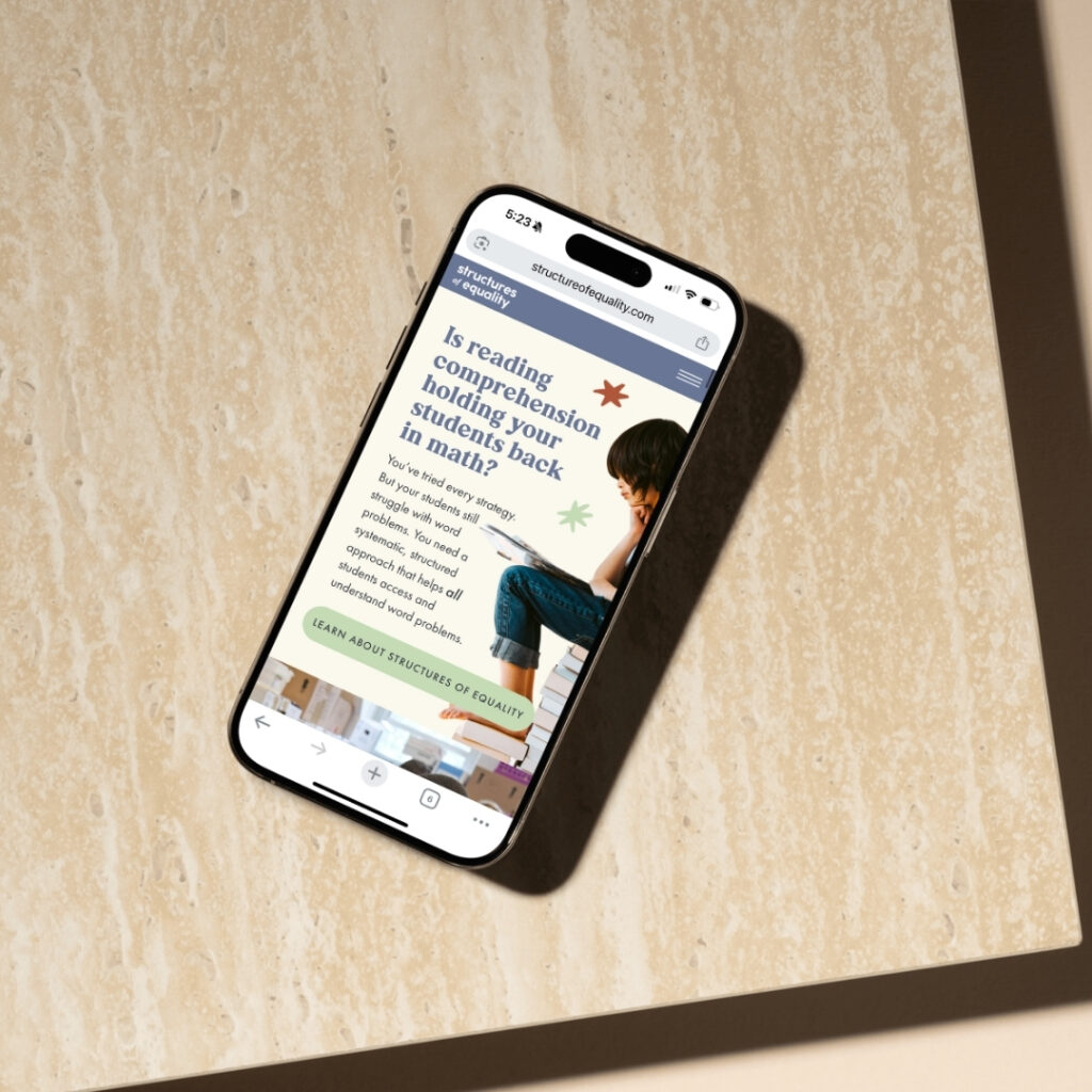
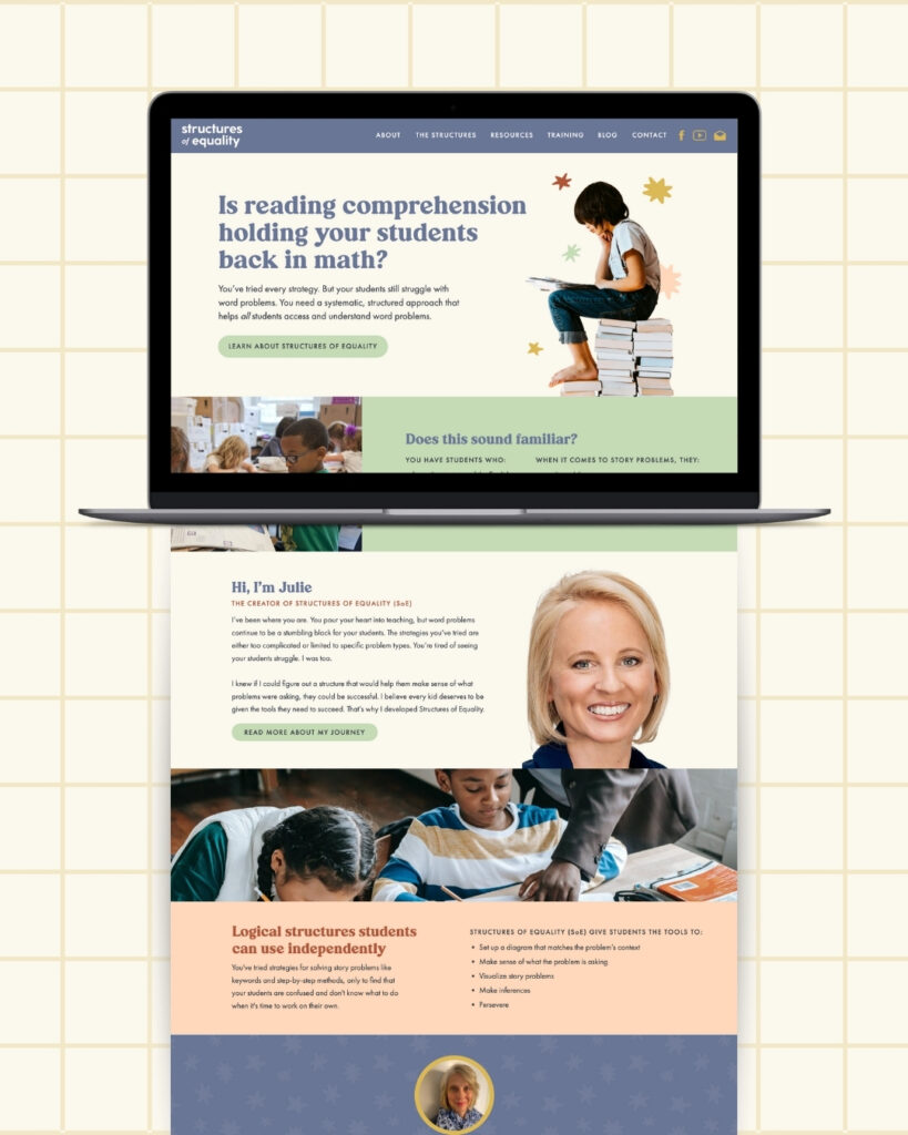

Redesigning the website for clarity and impact
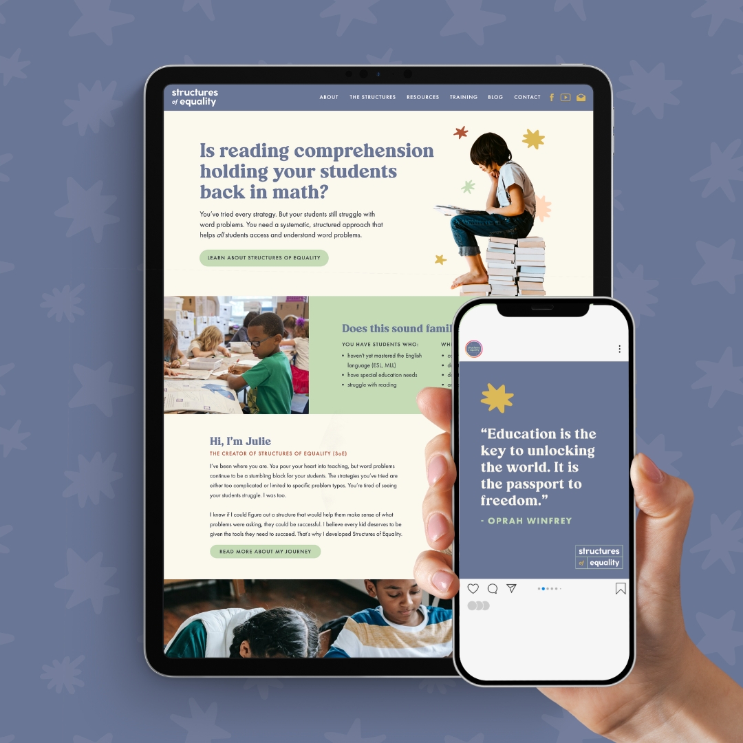
After establishing the brand foundation, I completely redesigned Julie’s website to reflect her new visual identity. The new Structures of Equality site organizes her methodology in a clear, accessible way that helps visitors immediately understand the framework’s benefits.
The website redesign prioritizes user-friendly navigation, allowing educators to easily find information about each of the three core structures (Parts Equal Total, Compare, and Repeated Equal Groups). I created dedicated sections explaining how the structures work, complemented by the custom illustrations and cohesive visual elements from the brand system.
To support Julie’s mission of making her teaching methods widely available, we integrated resource sections with downloadable materials and clear pathways for educators to engage with her content. The site balances professional credibility with approachable warmth – just like the brand itself – creating a digital home that effectively showcases her innovative approach to teaching math word problems.
Beyond the basics: comprehensive brand assets
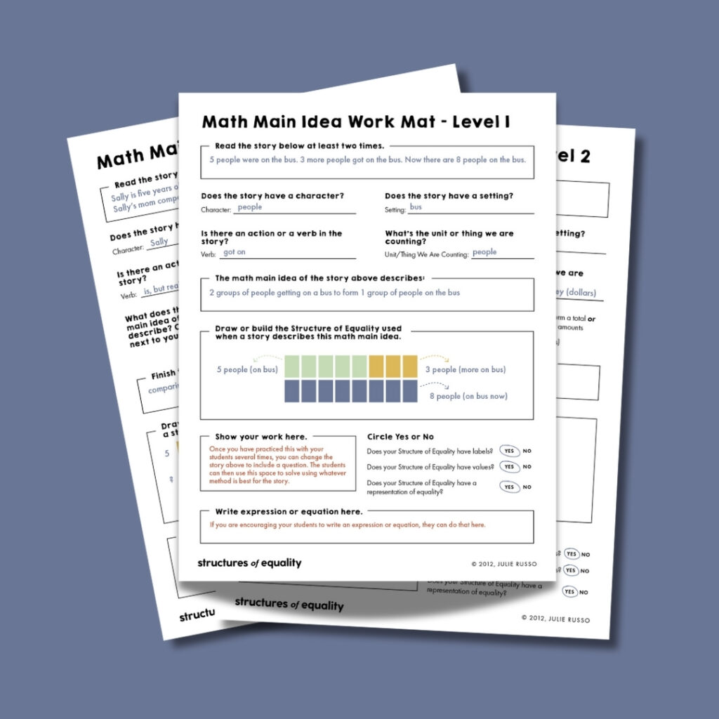
Following the initial brand and website redesign, my partnership with Julie continued through ongoing VIP Design Days. I created a comprehensive suite of teaching materials that maintained brand consistency while serving distinct educational purposes:
- 20+ downloadable classroom resources including anchor charts and teaching guides
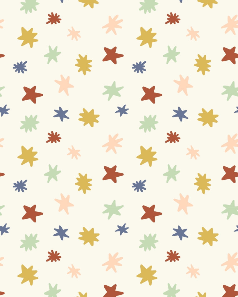
- Custom pattern designs and star-themed decorative elements
- Custom illustrations showing the mathematical structures themselves
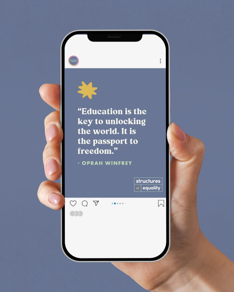
- Social media assets for multiple platforms
- YouTube opening and closing video frames
- Slide deck templates
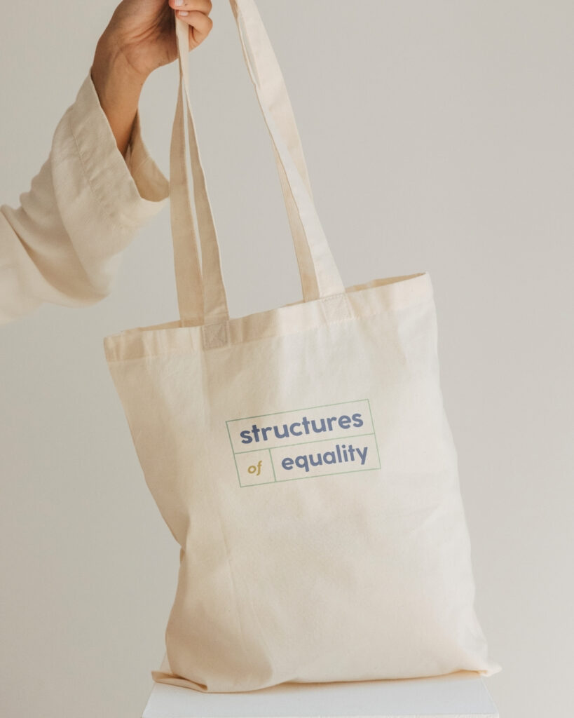
- Professional business cards and print collateral
The impact: from classroom technique to recognizable educational brand

After our project concluded, Julie shared: “I presented at the NC State Math Summit … Everything looked beautiful and I am so proud of where we are with the presentations, the website, the copy, the posters and printouts. Thanks to both of you for all your support!!!”
The brand design transformation gave Julie a professional, cohesive identity that effectively communicates the value of her teaching methodology. The new visual system not only looks more polished but functionally supports her mission to make math word problems accessible to all students.
By creating an educational brand design as clear and structured as her teaching method, I helped Julie focus on what she does best – teaching mathematics to kids – rather than getting bogged down in design details.
