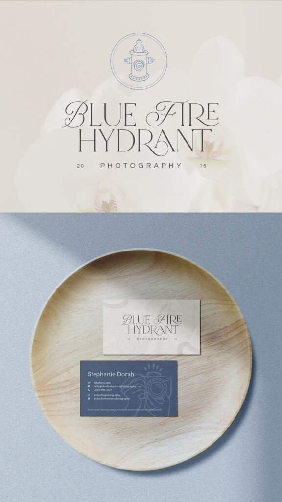
Stephanie is a family and senior photographer in the DC area whose work focuses on heirloom-quality photo art: large canvases, beautifully bound books, keepsake pieces meant to be passed down. Her previous branding (bright blues, stark blacks) didn’t match that at all. It read more like an edgy startup than someone creating something meant to hang in your home for decades, so we knew we had a lot of room to work with here.
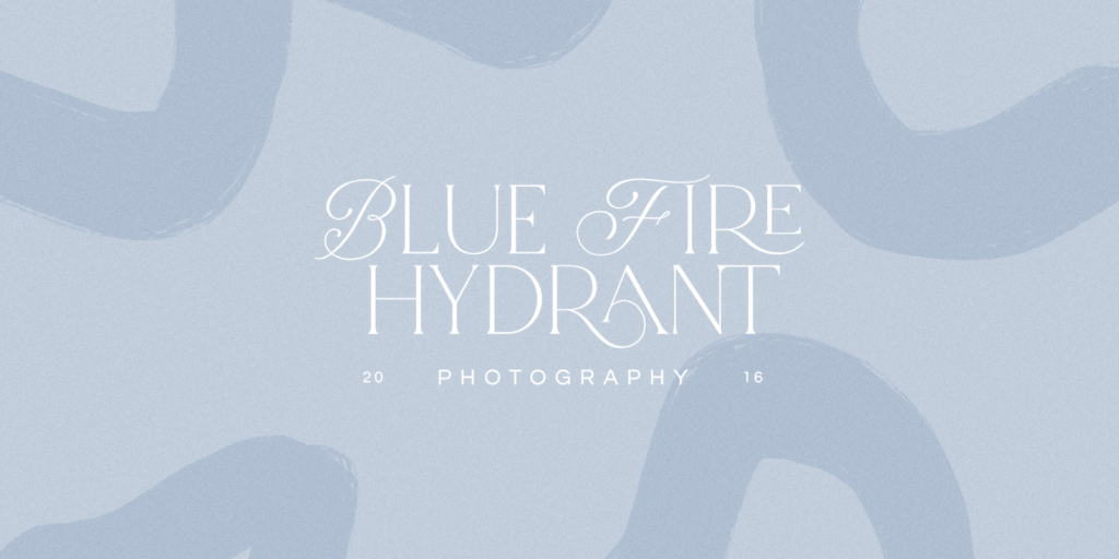
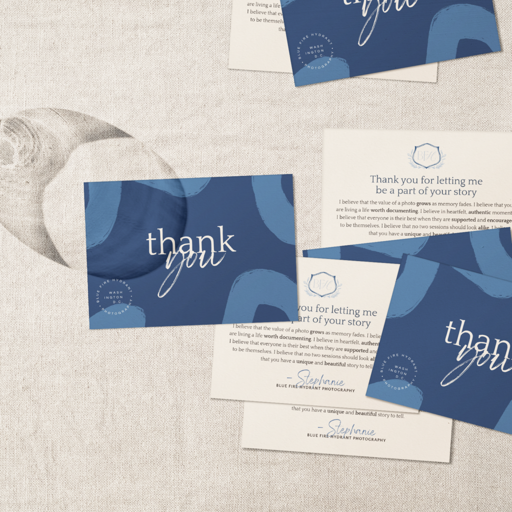
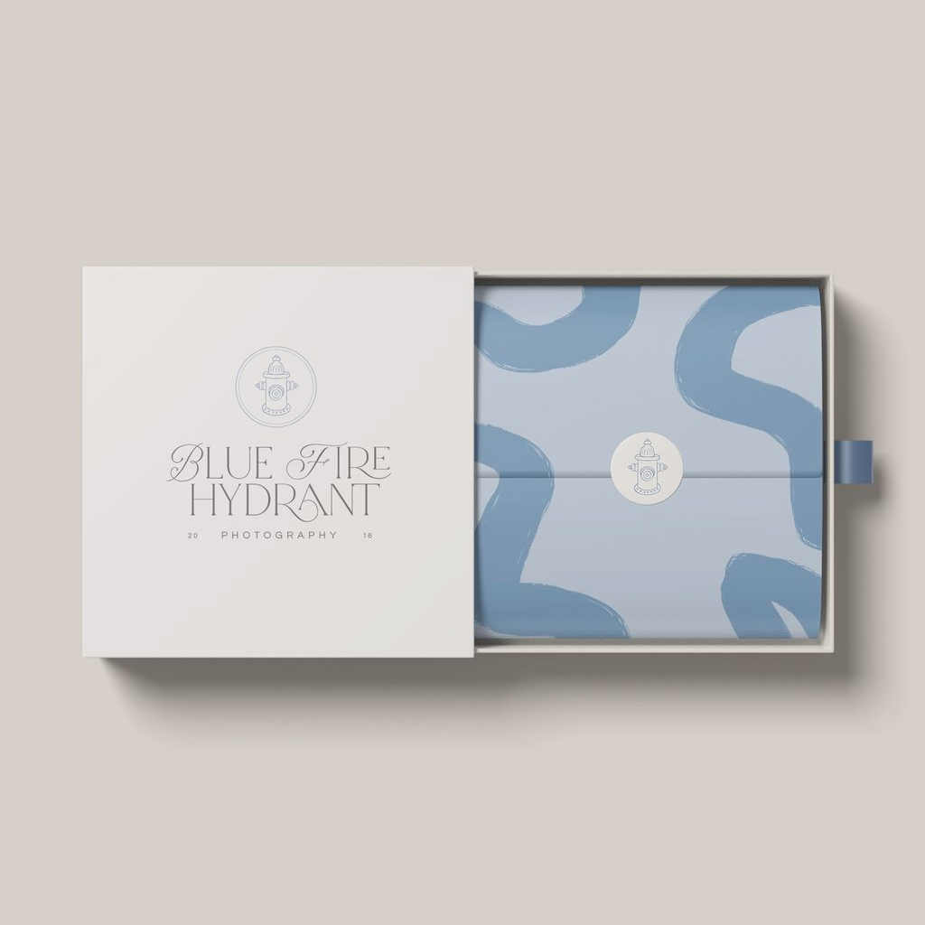
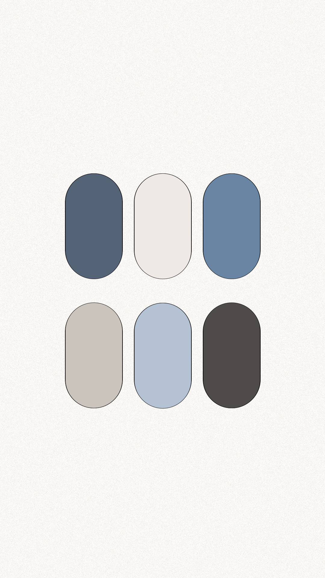
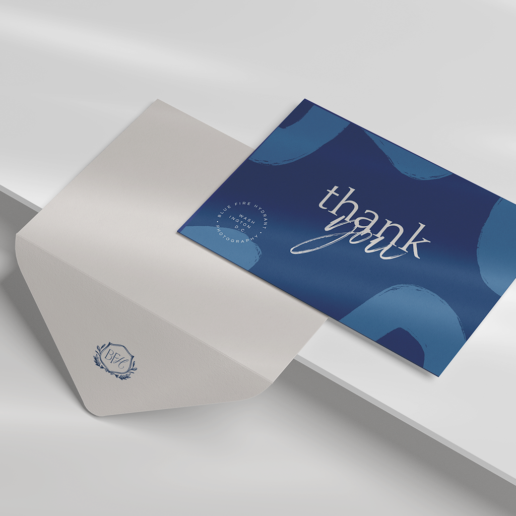
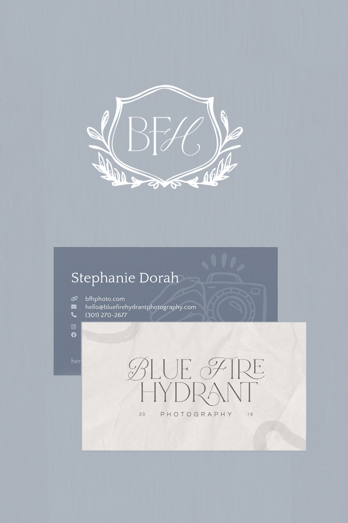
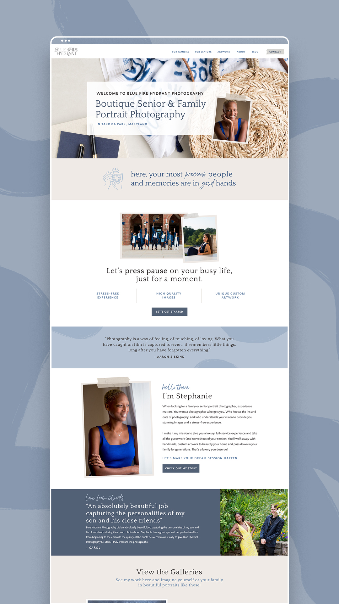
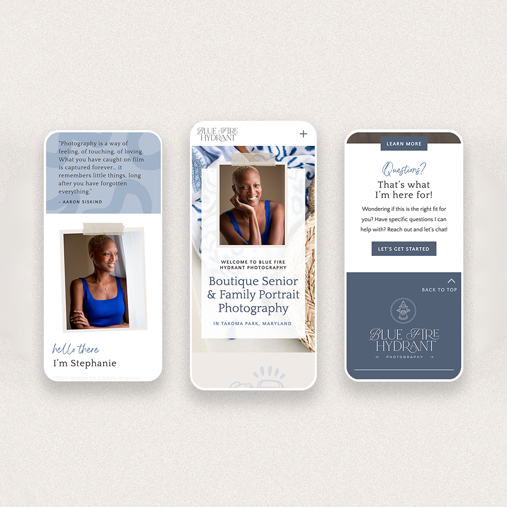
We pulled the whole visual direction from the idea that her work lives alongside her clients’ interiors, so the brand should feel like it belongs there too. Soft gray-blues and warm neutrals replaced the old palette. The logo pairs a delicate fire hydrant emblem with a mix of serif and sans-serif type, and we added custom brushstroke patterns throughout for a little artistic personality. The Showit website was rebuilt from the ground up with cleaner navigation and a layout that lets her photography breathe.