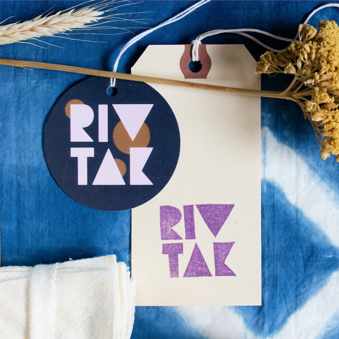
River Takada-Capel is the artist behind RIVTAK Handmade, a brand dedicated to creating environmentally responsible goods using only salvage and remnant materials. River’s work is maximalist, handcrafted, sometimes messy, always beautiful, and made with care. We wanted her branding to encompass many disparate concepts: earthy but otherworldly, old but new, colorful but neutral. Ultimately, we decided on a cohesive brand identity that felt modern, but still connected to tradition. RIVTAK’s gorgeous brand photography is by Kristin of Studio Aray.

An established artist in need of a cohesive brand identity
River is a friend of mine who reached out in the summer of 2019 about rebranding her business. She’s been selling her own clothing, accessories, art prints and other handmade wares for more than 10 years, and in that time her business had evolved in many ways. Like many solopreneurs (and especially those in creative spheres), most of her brand identity was DIY’ed and put together piecemeal over the years.
When we first met up for coffee to talk about her project, it was clear that she was ready to have a more cohesive and consistent brand identity, and to really sit down and approach her branding with intention. This can be such a hard task when you are running a business all on your own! Finding the time to focus on your own business is difficult enough, and figuring out your brand identity as a creative can be a real inward journey. A thoughtful rebrand provides an opportunity to slow down, assess your work, think hard about the things you love about it and the clients or customers you want to invite into your life – as well as the things and people you’d like to spend less of your energy on.
The discovery phase
Every branding project with Parson Lane begins with my Onboarding Questionnaire, an exercise that helps me understand my client’s business, vision, and target audience. While the Onboarding Questionnaire is an incredibly helpful tool for me, it can also be a surprisingly revealing exercise for my clients, helping them dig deeper into their values as a business and the “why” behind what they do. I’m a big believer in purposeful, informed design, so starting with developing a clear picture of the business I’m designing for is really important for my process.
River and I also began collaborating on a shared Pinterest board pretty early on in the process. Pinterest is an awesome tool for bouncing around ideas, and in River’s case, we definitely had no shortage of ideas. In fact, this was probably the most challenging (and most fun!) part of the project for me – working with a fellow creative meant that every time we met, we shared tons of images, concepts, and art with each other. Narrowing down the brand to a single, easy-to-digest concept was tough!
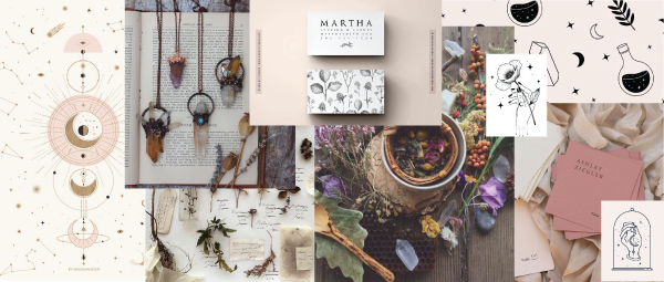
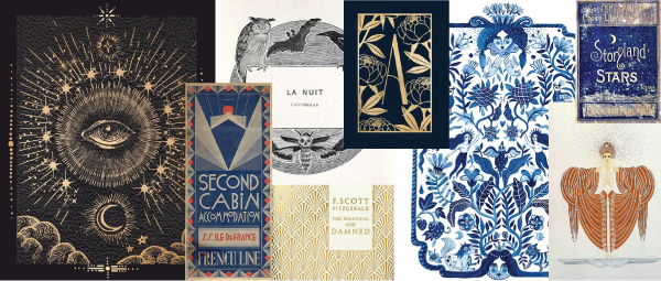
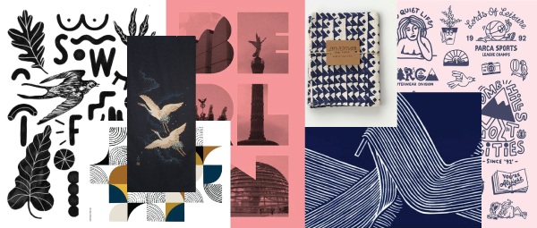
MOODBOARDS FOR THE PROJECT


Each moodboard explores different facets of River’s work and identity as an artist. Ultimately, we went with moodboard #3 and decided to design a brand identity that felt modern, but still connected to tradition.
Brand identity design


Translating RIVTAK’s new brand identity into a web design
With a solid set of logos, brand guidelines and assets in place, we moved on to re-designing the RIVTAK website. We started by identifying the most important things a visitor to her site should do:
- Learn about her various workshops
- Purchase her products
- Learn more about River’s process, values and past work
With these goals in mind, I started out by updating the site’s design to match her new brand identity, and then re-structuring the site’s content and navigation to provide a more easily navigable user experience. Her site was built on Squarespace, which made the task of re-designing all of her pages at once really easy; simply tweaking the site’s design styles updated all her content to match, site-wide. (Yet another reason why I love and often recommend Squarespace for small businesses.) Figuring out the best way to re-organize the site was certainly the more challenging part, and River and I met several times to narrow down the purpose she needed the website to serve before I began to make any changes.
The result is a cleaner and more user-friendly website, putting River’s workshops and products front and center while also educating her visitors on what sets her brand apart (namely, her use of upcycled and salvage materials, and her dedication to community building and inclusivity).


You can learn more about River’s work by visiting her website or following her on Instagram. Be sure to check out her blog post about our project to hear an in-depth client perspective of the rebranding process!
