All too often projects die in the maintenance phase. I’m not just talking about branding – this happens to projects of all stripes.
You decide you’re finally going to get organized. You make a detailed list of what needs organizing and create a blueprint for how to get it done. Then you brave Target or the Container Store, and pick out the perfect, color-coordinated bins, organizers, and tubs. You spend your long weekend arduously packing, rearranging, and editing.
Two months later you find all this work undone because you couldn’t maintain it.
You’ve heard it before – consistency is key.
For Parson Lane clients, I’ve put tools in place to empower you to maintain all the hard work we just put in designing your brand. This is achieved through your brand’s new best friend: your brand manual.
Meet Your Custom Brand Manual
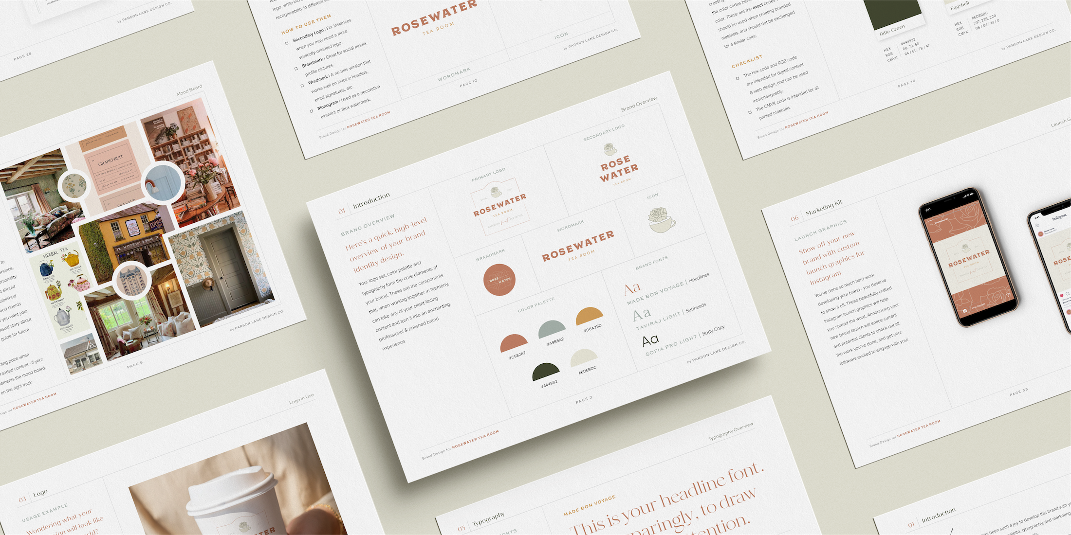
The brand manual that Parson Lane clients receive is designed to be an essential tool in your marketing arsenal and will serve you well into the future. Think of this document as a comprehensive starting point for all branded materials that you create for your organization.
The manual will outline your brand strategy, logo set, color palette, typography, and marketing kit. It will also cover practical ways of implementing your new brand design assets.
It is imperative that you stick to these guidelines while creating both digital and print content for your business or nonprofit so that your brand remains consistent and recognizable.
Chapter 1: Introduction & Brand Overview
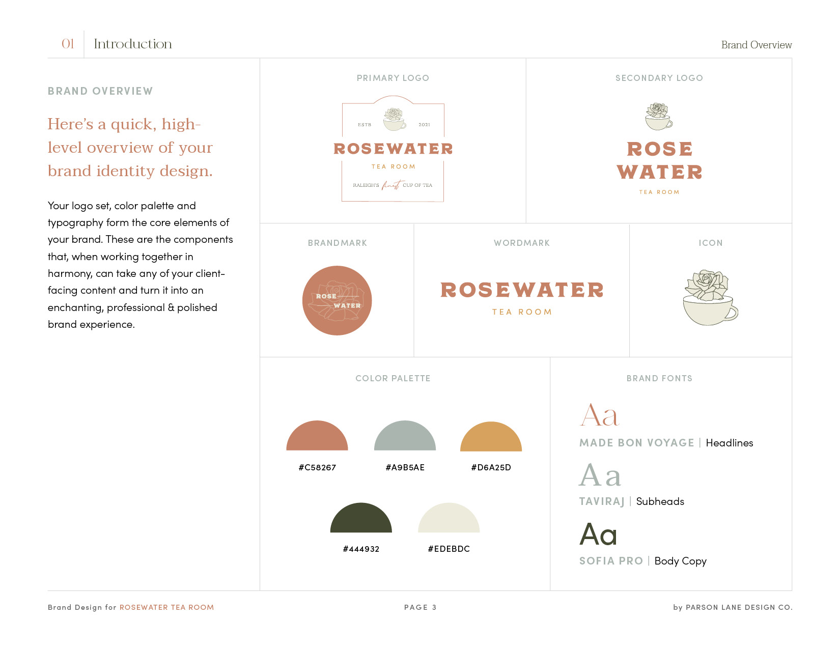
Think of your brand overview as your go-to or quick reference guide for all things you and your brand.
Awaiting you on this page are the core elements of your brand – your logo set, color palette, and typography.
Throughout the manual, I give special attention to each element and flesh out not only more details of what it is but why and how to utilize them.

Chapter 2: Strategy
You cannot overlook or underestimate strategy when it comes to your brand. Having beautiful and tailored assets doesn’t matter if you don’t understand how they serve you and your potential clients or customers. For clients who’ve purchased our brand design package, your strategy chapter will contain your brand blueprint and moodboard.
Your brand blueprint establishes the basics of your brand identity. It reminds you of your mission and helps establish your ideal client (the person your brand design should most appeal to), your brand goals and values, where your brand is situated in the marketplace, and some key words to help establish the tone of your brand.
If the blueprint displays your brand through words, your moodboard complements it with visuals. Your moodboard is meant to inspire and establish the look and feel of your brand. Moodboards can develop the feelings you want your brand to invoke, tell a visual story about your brand, and be a guide for future brand imagery.
For brand identity clients, the strategy chapter will delve much deeper. Rather than just a single-page brand blueprint, you’ll receive an in-depth messaging guide, including elements like your mission statement, vision statement, brand values, market analysis, unique selling proposition, target audience profile, buyer persona, and more.
On days when you need to feel inspired again, I hope your strategy will be the spark you need to keep you moving forward and on track.
Chapter 3: Logos
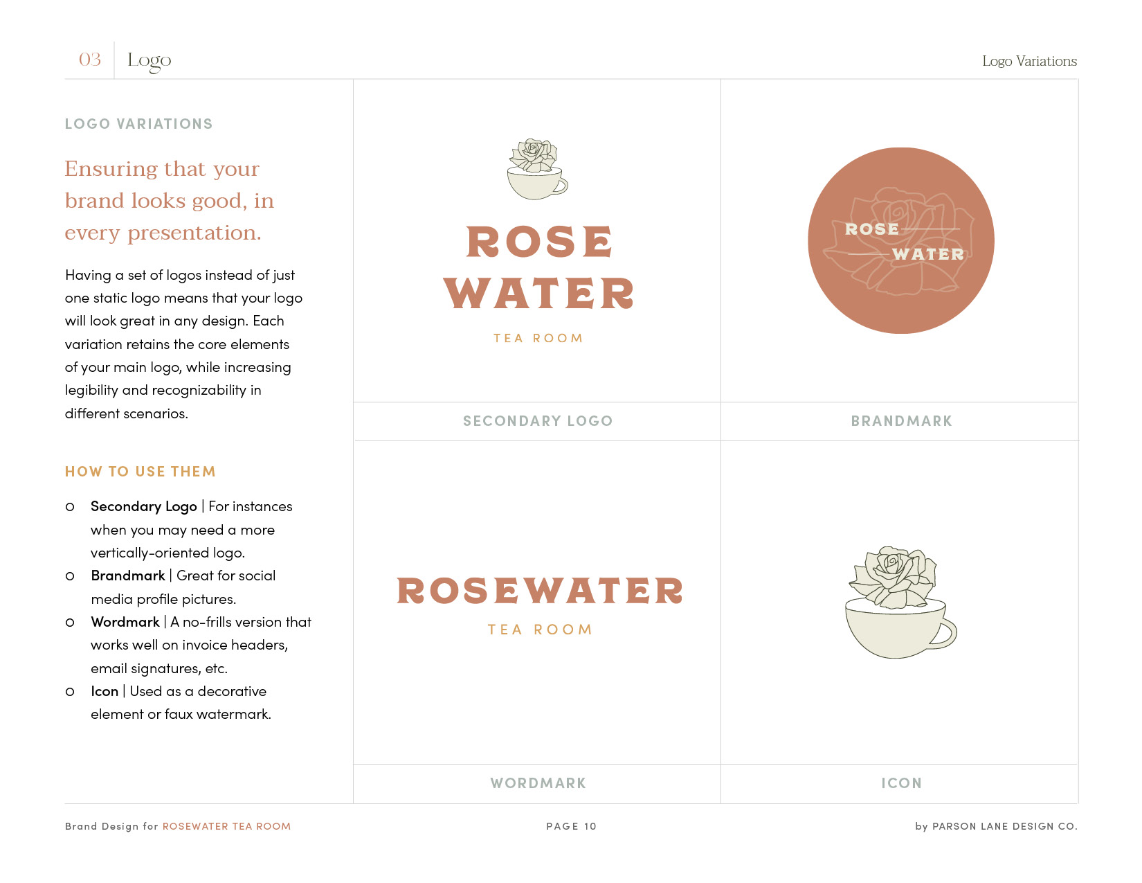
When we think of brands, typically one primary logo comes to mind. It’s the one we encounter most frequently. However, your brand manual includes your primary logo and variations.
Having a set of logos instead of just one static logo means that your logo will look great in any design. (What works well online may not be the best when you attempt to screen print it onto a bucket hat, for example.) Your brand manual will outline which logos to use where. I’ll also explain your different logo file formats and when to use them.

Chapter 4: Color
Consistent color usage goes a long way in developing brand recognition. To ensure consistency, I include the exact codes for your colors. As much as you may be tempted, don’t exchange them for similar colors. Those colors are not your brand.
I don’t expect you to have the same relationship and history with color as I do, so your manual will teach you in one minute what I’ve spent years mastering – which colors to use for what purposes. You’ll also find tips for what types of color codes to use for different media.
Chapter 5: Typography
Consistent usage of your brand fonts when creating branded materials is key to maintaining the integrity of your brand, as well. You’ll find all your new fonts here as well as how they should be used. Stick to the guide. You’ll be surprised how switching up fonts can change the look and feel of branded materials.
Your brand manual will also include download links to your new fonts so you can begin using them immediately across all platforms, which I highly recommend.
Chapter 6: Marketing Kit
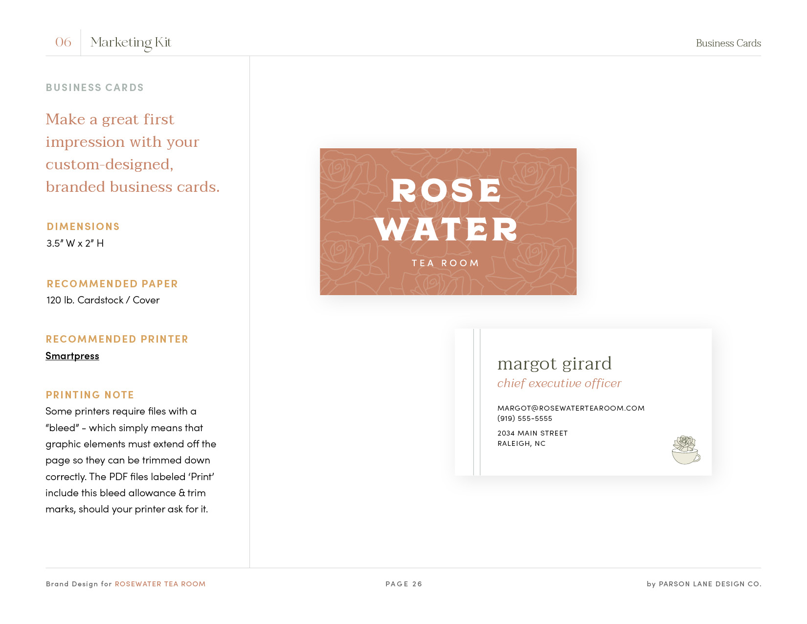
Here’s a fun one! If you purchased the marketing kit add-on along with your brand design package, your brand manual will include a chapter on how to use your brand collateral. You’ll see the final products of everything that’s been outlined previously in the manual. Real, live branded materials.
You’ll have access to the designs for print and digital use as well as mock-ups so you can imagine your brand in the wild.
Any print materials also include dimensions and printing recommendations and notes.

Your Brand’s New Best Friend
If that feels like a lot, it’s because it is. I aim to make your brand manual exhaustive, so you have all you need to create and maintain your brand identity on your own.
I’m not leaving you to maintain your brand all alone, but I am providing you with the tools you need to feel empowered to create. I’m giving your business a new best friend: your brand manual.
Explore how Parson Lane can elevate your brand through purposeful designs… and keep it that way. Choose your brand design journey and schedule your free consultation today!
