
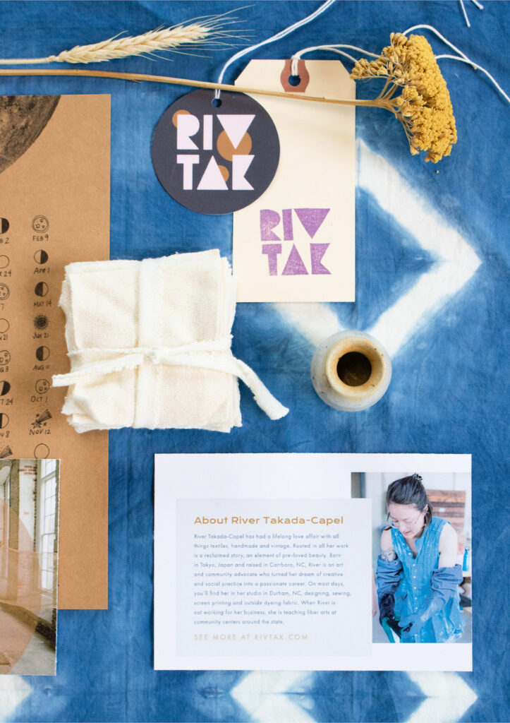
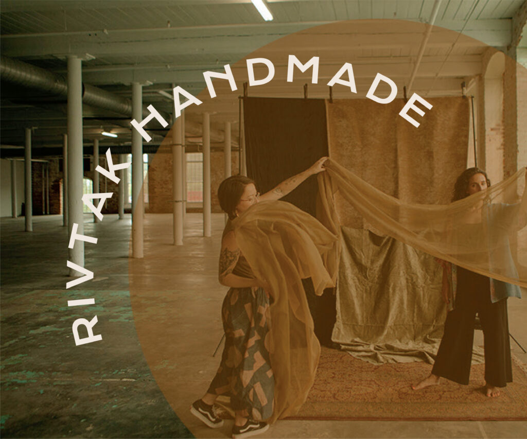
River Takada-Capel is the artist behind RIVTAK Handmade, a Durham-based brand creating environmentally responsible goods using only salvage and remnant materials. River’s work is maximalist, handcrafted, sometimes messy, always beautiful, and made with care. She’s also a friend of mine, which made this project especially fun.
River had been running her business for over 10 years when she reached out, and like a lot of solopreneurs (especially creative ones), her brand identity had been DIY’ed and pieced together over time. She was ready to approach it with real intention. The challenge was that we had no shortage of ideas between us — working with a fellow creative meant every meeting turned into a whirlwind of images, concepts, and inspiration. Narrowing all of that down to a single, cohesive direction was the hardest and most fun part of the whole project.
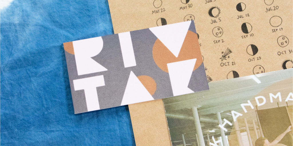
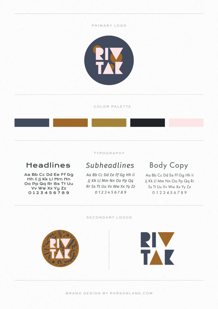
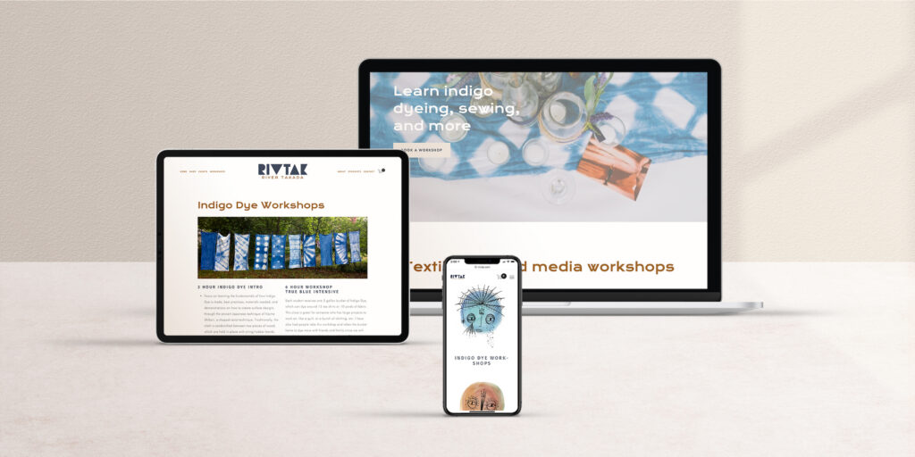
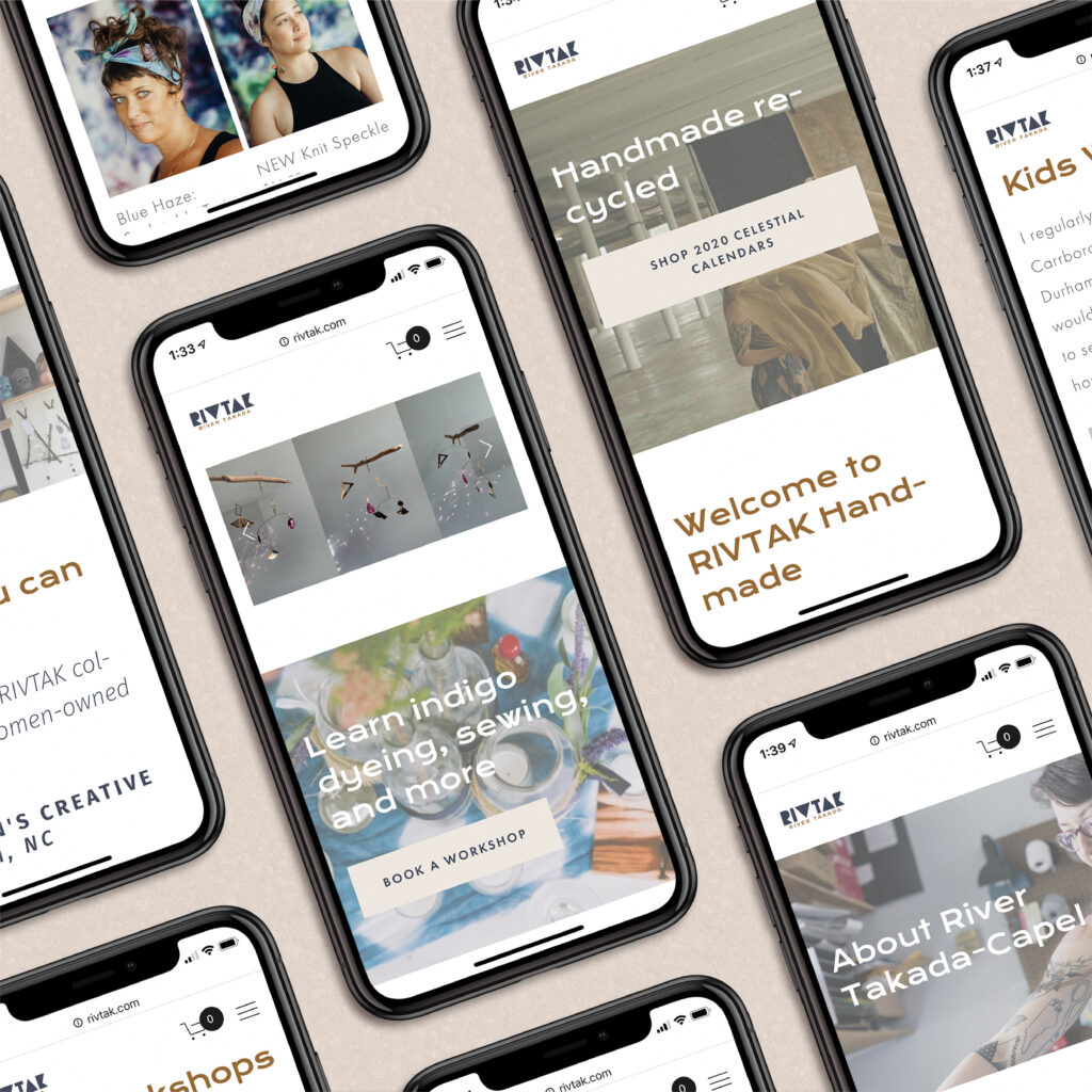
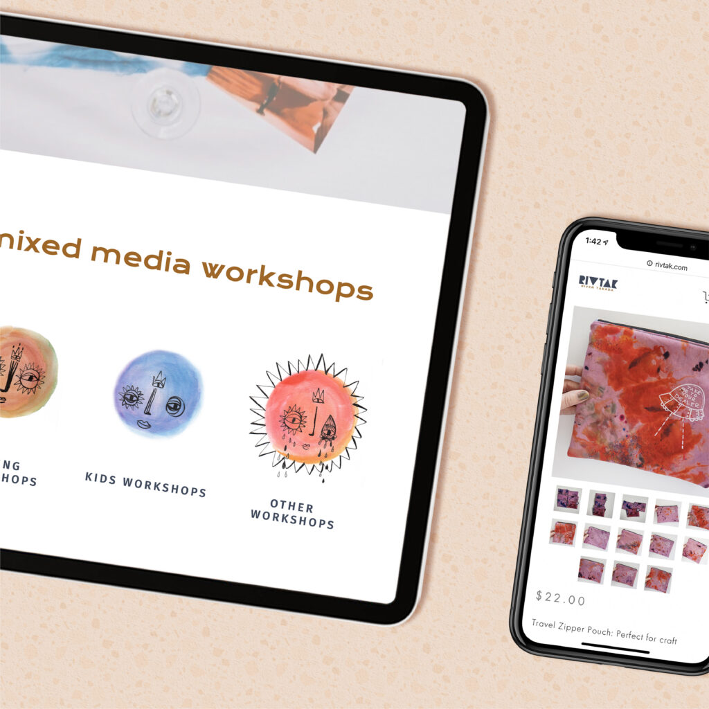
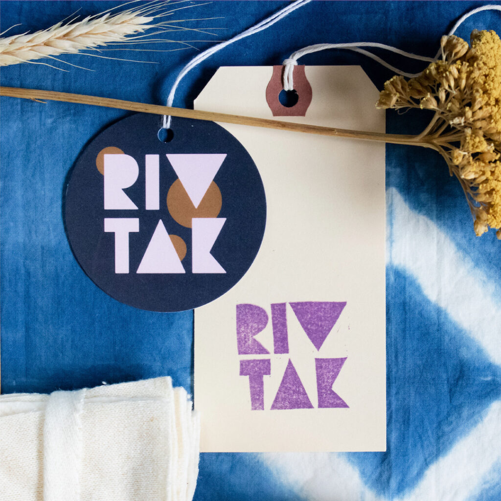
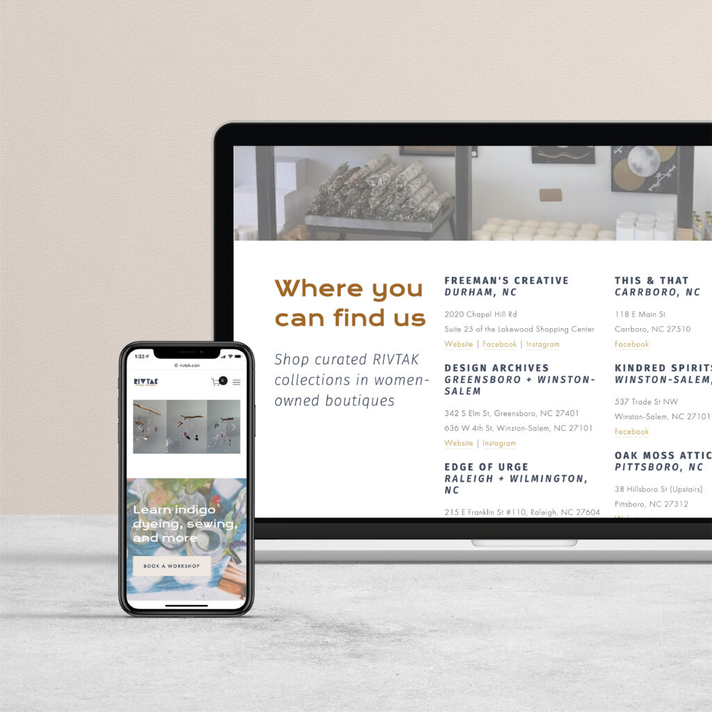
We landed on a brand that feels modern but still connected to tradition, which captures the tension in River’s work really well. The color palette, typography, and logo system all lean into that earthy-but-otherworldly quality her products have. We also redesigned her Squarespace website to put her workshops and products front and center, with a cleaner structure that’s easier to navigate.
Project Moodboards
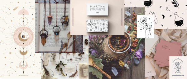
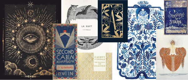
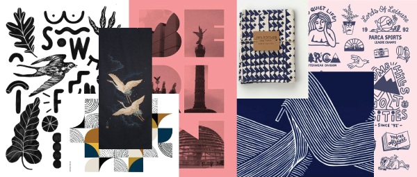
Each moodboard explores different facets of River’s work and identity as an artist. Ultimately, we went with moodboard #3 and decided to design a brand identity that felt modern, but still connected to tradition.
Brand Identity Design

Web Design
Brand photography by Kristin of Studio Aray. You can learn more about River’s work by visiting her website or following her on Instagram. Be sure to check out her blog post about our project to hear an in-depth client perspective of the rebranding process!
