
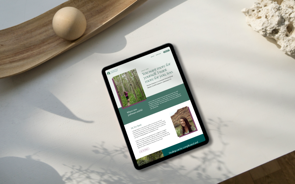
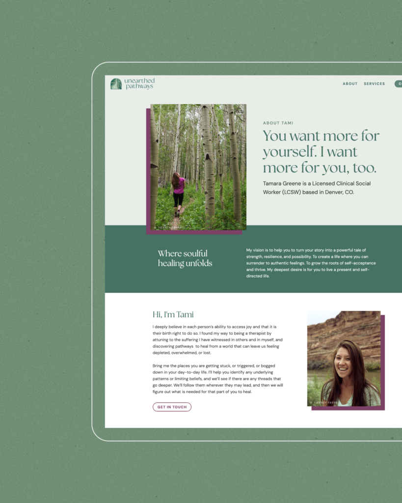
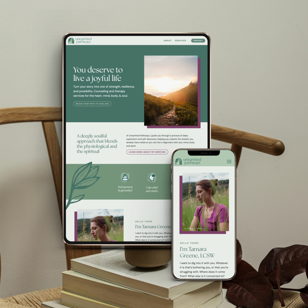
Tamara Greene is a licensed clinical social worker based in Denver, Colorado. Tami reached out when she was just starting out as a solo therapist, ready to build something that actually reflected the kind of care she wanted to offer. She’s spiritually minded and deeply intuitive in her approach, so we knew early on this brand needed to feel less clinical and more like a walk through the woods – grounded, a little mystical, calming.
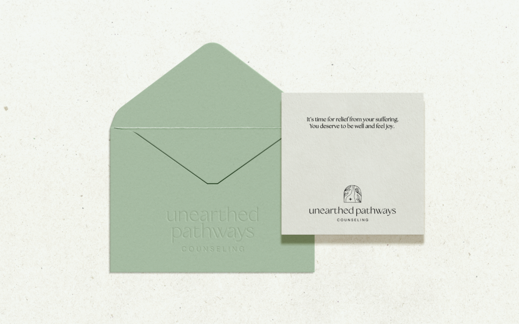
We built out her full brand identity with that in mind: a lily pond palette of deep turquoise-greens with a plum accent, and a logo depicting a path winding through the woods, framed by crocus. It’s a plant known for its deep root system, which felt like the right visual metaphor for the kind of grounding Tami offers her clients. The typography carries that same balance, pairing an elegant serif with clean, easy-to-read body copy so the brand feels polished without losing its warmth. Copywriter Stacy Eleczko, a Parson Lane collaborator, led the brand messaging and website copy, giving Tami language that sounds like her.
Tami’s a good personal friend, and it was a joy getting to build a brand for the practice she’d been dreaming about.







January 6, 2025
completed on —
