


All too often projects die in the maintenance phase. I’m not just talking about branding – this happens to projects of all stripes.
You decide you’re finally going to get organized. You make a detailed list of what needs organizing and create a blueprint for how to get it done. Then you brave Target or the Container Store, and pick out the perfect, color-coordinated bins, organizers, and tubs. You spend your long weekend arduously packing, rearranging, and editing.
Two months later you find all this work undone because you couldn’t maintain it.
You’ve heard it before – consistency is key.
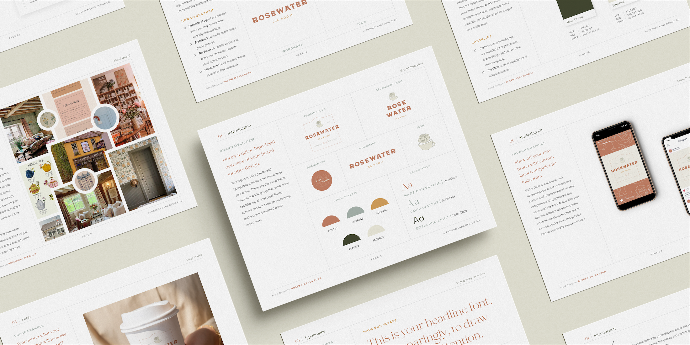
For Parson Lane clients, I’ve put tools in place to empower you to maintain all the hard work we just put in designing your brand. This is achieved through your brand’s new best friend: your brand manual.
Meet Your Custom Brand Manual
Your brand manual is designed to be the starting point for everything you create going forward. It outlines your brand strategy, logo set, color palette, typography, and collateral, along with practical guidance for how to actually use all of it.
Sticking to these guidelines, in both digital and print materials, is what keeps your brand recognizable as it grows. Skip that step and even great individual pieces start to feel disconnected from each other.
Chapter 1: Introduction & Brand Overview
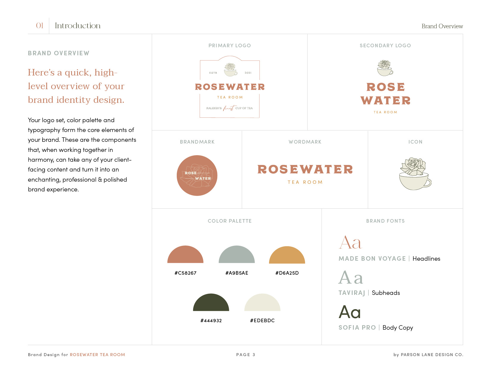
Think of your brand overview as the quick-reference version of your whole brand – your logo set, color palette, and typography, all in one place. The rest of the manual goes deeper into each of these, covering not just what they are but why and how to use them.
Throughout the manual, I give each of these elements its own space, going beyond the basics into why they work and how to use them.
Chapter 2: Strategy
Beautiful, tailored assets only go so far if you don’t understand how they’re meant to serve you and your clients. For brand design clients, your strategy chapter includes your brand blueprint and moodboard.
The blueprint covers the basics of your identity: your mission, your ideal client, your goals and values, where you sit in the market, and the language that sets your tone. If the blueprint tells your brand’s story in words, the moodboard tells it visually – the feelings you want your brand to evoke and a reference point for any future imagery.
For brand messaging clients, this chapter goes further still. Instead of a single-page blueprint, you’ll get an in-depth messaging guide covering your mission and vision statements, brand values, market analysis, unique selling proposition, target audience profile, and buyer persona.
On days when you need to feel inspired again, this chapter will be the spark you need to keep you moving forward and on track.
Chapter 3: Logos
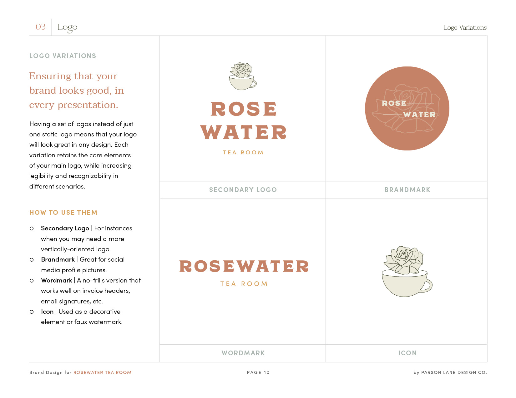
When we think of brands, typically one primary logo comes to mind. It’s the one we encounter most frequently. However, your brand manual includes a full set of variations, because a mark that looks perfect online won’t always work printed small on a baseball cap. Your manual outlines which version to use where, along with the different file formats and when each one applies.
Chapter 4: Color
Consistent color use is a big part of what makes a brand recognizable, so your manual includes the exact codes for your colors specifically. It’s tempting to swap in something close enough when you’re in a hurry, but a close match isn’t your brand – it just looks like a slightly different one.
I don’t expect you to have the same relationship and history with color as I do, so your manual will teach you in one minute what I’ve spent years mastering – which colors to use for what purposes. You’ll also find tips for what types of color codes to use for different media.
Chapter 5: Typography
Consistent usage of your brand fonts when creating branded materials is key to maintaining the integrity of your brand, as well. You’ll find all your new fonts here as well as how they should be used. Stick to the guide. You’ll be surprised how switching up fonts can change the look and feel of branded materials.
Your brand manual will also include download links to your new fonts so you can begin using them immediately across all platforms, which I highly recommend.
Chapter 6: Brand Collateral
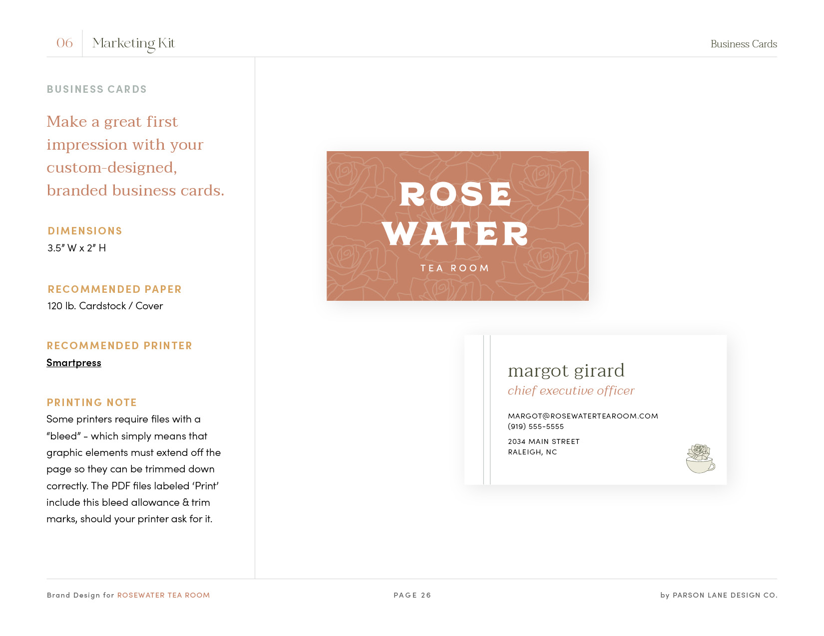
If you added the brand collateral kit to your brand design package, this chapter shows everything that’s been outlined so far actually put to use – real, finished materials, both print and digital, with mockups so you can picture them in the world. Print pieces come with dimensions and printing recommendations included.
Your Brand’s New Best Friend
If all of this sounds like a lot, that’s because it is. The goal is for your manual to be thorough enough that you can maintain your brand identity confidently on your own, without guessing or reinventing decisions we already made together.
At the end of every brand design project, I create a customized brand manual with all of your brand’s guidelines clearly laid out. But beyond just sending the manual to you, I’ll also reach out to schedule a live walk-through, so you have a chance to review all of our work together, understand where to find the information you need, and ask any questions you may have. That way, it’s never just a file sitting unopened in your inbox – it’s something you actually know how to use.
And if brand maintenance isn’t how you want to spend your time, that’s exactly what VIP Design Days are for. I can handle the small refreshes and one-off pieces while you focus on running your business.

